#tutorial adobe indesign
Explore tagged Tumblr posts
Visit Tumblr Blog
Explore Tumblr blogs with no restrictions, modern design and the best experience.
Last Seen Tumblr Blogs


Fun Fact
Tumblr has 16.74 million mobile monthly users in the US.
Text
Master Adobe InDesign with These Essential Keyboard Shortcuts! 🎨✂️
Looking to speed up your design workflow in Adobe InDesign? Keyboard shortcuts can help you save time and boost productivity! Check out this comprehensive guide to InDesign Shortcut Keys that will make your life easier and your designs more efficient. 🔥 From quick navigation to formatting tricks, this list covers everything you need to know! 👉 Read the full guide here: InDesign Shortcut Keys
2 notes
·
View notes
Photo
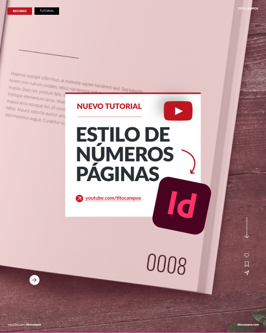
En Indesign, es posible cambiar el estilo/apariencia de los números en la numeración de páginas, para así tener mayor personalización en el proyecto que estemos desarrollando. Aquí está el enlace al video: https://www.youtube.com/watch?v=ek3gTy6wKqQ ___ Para ver clases y tutoriales paso a paso…no olvide visitar ✅ https://www.youtube.com/titocampos Encuentre en mi blog otras frases, tips, lecturas y recursos gratuitos ➡️ https://blog.titocampos.com Más contenido en los enlaces de la biografía ➡️ https://links.titocampos.com _____ ñoPagina
#adobe#indesign#numeracion#numerar#numerarpaginas#enumerar#estilos#tutorial#gratis#clases#aprender#adobetutoriales#aprenderadobe#editorial#dise
0 notes
Text
Se ti interessano Grafica Pubblicitaria, Grafica Editoriale, Web Design da oggi propongo lezioni private tramite la piattaforma Superprof, puoi vedere il mio profilo qui: https://www.superprof.it/grafico-web-designer-esperto-certificato-adobe-offre-lezioni-private-illustrator-photoshop-indesign-wordpress-tecniche.html
0 notes
Text
حل مشكلة تبعثر ادوات الادوبي برمير(Solving the problem of scattering Adobe Premiere tools)
youtube
أدوبي بريمير هو جزء من مجموعة برامج أدوبي الإبداعية، وهو مصمم لتحرير ومونتاج الفيديو بكفاءة واحترافية. يتيح للمحترفين والهواة إنشاء محتوى فيديو مميز بجودة عالية. ظهر برنامج بريمير لأول مرة في عام 1991، ومنذ ذلك الحين شهد تطوراً كبيراً وتحسينات مستمرة. ## مميزات أدوبي بريمير: 1. واجهة مستخ��م بديهية: توفر واجهة بريمير تجربة استخدام سلسة وبديهية، مما يساعد على زيادة الإنتاجية والتركيز على الإبداع. 2. دعم لمجموعة متنوعة من تنسيقات الفيديو: يمكن لبريمير التعامل مع العديد من صيغ الفيديو والصوت، مما يجعله مناسبًا للعمل مع ملفات الفيديو من مصادر مختلفة. 3. أدوات تحرير قوية: يوفر البرنامج مجموعة واسعة من الأدوات لتحرير الفيديو بشكل دقيق وإجراء التعديلات اللازمة على الصورة والصوت. 4. مؤثرات بصرية وتأثيرات انتقالية: يحتوي بريمير على مكتبة ضخمة من المؤثرات البصرية والتأثيرات الانتقالية التي يمكن استخدامها لتحسين جاذبية الفيديو. 5. دعم للمؤقت الزمني والملحقات الإضافية: يسمح بريمير بدمج المؤقت الزمني وإضافة ملحقات إضافية من طرف ثالث لتعزيز قدرات التحرير. 6. التكامل مع منتجات أدوبي الأخرى: يمكن لبريمير التكامل بسلاسة مع برامج أخرى من أدوبي مثل فوتوشوب وأدوبي أفتر إفكتس، مما يسهل عملية العمل المشترك بين مختلف التطبيقات. ## استخدامات أدوبي بريمير: 1. إنتاج الأفلام والأفلام الوثائقية: يستخدم بريمير في صناعة الأفلام والأفلام الوثائقية، حيث يتيح تحرير المشاهد وتنسيقها بشكل احترافي. 2. إنتاج المحتوى للتلفزيون والويب: يستخدم بريمير في إنتاج البرامج التلفزيونية ومقاطع الفيديو للنشر على الإنترنت ومنصات التواصل الاجتماعي. 3. الفيديو التعليمي والتدريب: يستخدم البرنامج لإنتاج مقاطع الفيديو التعليمية والتدريبية التي توضح العمليات والمفاهيم بشكل مرئي. 4. تحرير الفيديو الشخصي: يمكن للمستخدمين الهواة استخدام بريمير لتحرير مقاطع الفيديو الشخصية وتجميع الذكريات بشكل مميز. باختصار، أدوبي بريمير هو أداة قوية وشاملة لتحرير ومونتاج الفيديو. إنه يلبي احتياجات المحترفين والهواة على حد سواء، ويعتبر أحد الأدوات الأساسية في عالم صناعة الفيديو.
#adobe premiere pro tutorial#adobe premiere pro#adobe premiere 2020#adobe premiere 2022#كتابة الملاحظات في برنامج ادوبي أكروبات#how to use premiere pro#برنامج ادوبي أكروبات#premier#adobe creative cloud#adobe#كتابة الملاحظات#برمير#دروس برمير#تصميم بالفوتوشوب#تصميم كتاب#after afffects#تعليم الفوتوشوب#eps#png#indesign#تصميم صورة#photoshop#درس فوتوشوب#دروس فوتوشوب#تعلم انديزاين#اليستريتور فكتور#ps#pdf#jpg#انديزاين
0 notes
Text
Hey so you can format your ebook in MS Word.

This is a *very* quick demo that I threw together as an example. These are for publshing on places that use PDFs, not .epubs, like Ko-Fi. I use .epubs so I'm not super knowledgable on which sites prefer PDFs.
And the crucial part and appeal of ebooks is that the're reflowable. Which means that the end user picks the font size and shape for their e-reader and personal experience. A regular MS Word PDF isn't reflowable.
There are ways to do it fully, and tediously, to make it reflowable with Word, I just didn't bother, but there are tutorials out there. This is post is specifically for PDFs.
If you're not loading a book into an e-reader, you can use MS word to still make your PDF *look* like a print book.
Saying this now because in trying to read a book printed on 8.5x11 legal paper with those margins is a little tough.
And it's not hard, either. You just go into the layout settings and change it from "Letter" to something more fitting of a standard book page size. I picked A5 for this example.
Drop-Cap is also a super simple option, then set the text to align justified, add your page numbers, and boom.
I will say, though, that as someone with a pretty intense need for full creative freedom, MS Word is infamous for being finnicky and difficult when you try to get complicated beyond black and white text on the page, doing any sort of fancy formatting especially with images.
This is what I did in Adobe InDesign, a program built for the layout and design of print media used by professionals across industries:

I made that chapter art and my first chapter pages don't have page numbers by choice. This is the full print-ready page of the PDF I send to my printers, not the .epub file.
You do not need InDesign, there are plenty of programs out there (like Vellum) with less of a learning curve and more plug-and-play options. ID is just what I use because I already know it.
MS Word is good enough for what it's good for, and if you are giving people PDFs to read, it doesn't take much to make their reading experience that much more enjoyable by making it *look* like an actual book, not just a Word document.
#writeblr#writing#writing a book#writing advice#writing resources#writing tips#writing tools#ebooks#ms word
31 notes
·
View notes
Note
That National Geographic leather binding for Yellowstone is fucking Gorgeous!!! (Pardon my Language)
How long have you been binding, and what would you recommend to someone who wants to try it for themselves?
hello and thank you so much!! I worked really hard on that one (and no pardon needed haha)!
I started binding in February of 2021, which means in a few months I'll have reached 4 years. It's been an awesome journey!!
If you'd like to try it for yourself, I'd recommenda few things!
1) You can 100% try out the basics with near free or cheap materials. People typeset in Word or Google Docs or Pages. You can print on printer paper & use regular sewing thread & scavenge board from old books or notebook backs or do a limp leather binding & use no boards at all. You can make paper pamphlets. Any comments I make following this are about my preferences for best results. The most expensive part that cannot be avoided is printing. On the other hand expenses can wildly escalate if you're committing to it; once you are doing leather it becomes somewhat unavoidably expensive.
2) Check out some tutorials from SeaLemon or DAS Bookbinding on YouTube for the physical construction. SeaLemon is really clear for a beginner starting out, but then I'd move to DAS for better technique (DAS also has a beginner series though). I watched DAS Bookbinding videos for three weeks straight before I was able to start, & while that doesn't maybe work out for everyone I do think it gave me a pretty strong basis of understanding for structural techniques. DAS is *really* good at explaining why he thinks you should do something. The structure of the NatGeo bind is basically DAS's video on a rounded & backed bradel binding (but with leather & sewn on recessed cords). There is some good stuff on Tiktok/IG, but watch short-form videos/reels with caution. They move a little fast and I've seen a couple give instructions that can result in structural flaws (not that this is unique to the form, cross-referencing on instructions from any source is a good practice). They are good for if you're looking for a specific technique (particularly modern decorative ones, like cricut use, edge gilding, HTV application). There are also published books you can buy or maybe request through your library, such as Hollander's Introduction to Bookbinding. Renegade Bookbinding Guild runs a whole bunch of technique-specific in-house zoom classes annually.
3) Look to other fanbinders for tutorials on how to format the text (this is because most pro bookbinders do not do both text design & book creation! it's a pretty unique feature of fanbinding). @renegadeguild has some publically provided resources on our website here and more typesetting tutorials for a whole host of softwares (Affinity Publisher is my choice - one time purchase, fuck you very much Adobe InDesign) located in the discord server. Anyone 18+ can join the Discord. The NatGeo inspired book (text & dust jacket) was created in Affinity Publisher.
4) Join a community of fanbinders! It's really lovely. The space has exploded & there are tons of people to be friends with, trade tips, & cheer each other on. I'm part of @renegadeguild and we do a whole bunch of events throughout the year, and we have an in-person retreat every other year. I've met with over 20 different renegaders so far, in three different countries, and it's been such a blast. Definitely the community helps keep up the motivation. Renegade isn't the only community out there though! There's groups more rooted in IG/tiktok circles that have their own discords, plus a number of FB groups. I do think most people who are comfortable on tumblr enjoy Renegade's vibe.
5) While I learned most of what I do online, some things really benefit from in-person learning. If you want to do leather binding I would really recommend trying to take an in-person class. I did two attempts at a leather binding on my own before I decided to hold off until I'd had at least one in-person class. Leather binding can be extremely frustrating, especially when you can easily end up with a book that looks worse than a cloth binding at your same skill level but for double the cost. Imo this is mostly because the leather specific skills like paring, warp management, and assessing a random piece of leather for bookbinding suitability are all pretty tactile experiences, all of which are difficult to assess through a screen and can result in an unpleasantly bulky/stiff/shapeless book if ignored. For example- while this book of mine is a pretty popular post, I don't enjoy holding it and reading it, especially in contrast to the NatGeo bind. Part of this was the material I chose; part was not being able to adhere to the instructions quite well enough; part was just not knowing enough about what I was doing; part is they're different constructions. This might just be a me thing though; I'm sure others have had success with online only tutorials for leather.
6) I'm not going to get into specific tools bc that could be a whole post, but some things are necessary (printer access), some things are necessary depending on style, some things are "makes life easier but only drop the money if it's stopping you from making books out of frustration", some things are just technique-specific tools. Examples - sewing frames are often brought up but are never necessary unless sewing on cords; cricuts & cutting machines are commonly used in fanbinding circles but I don't have one (& don't intend to atm).
7) Don't be shy to offer the author a copy!! Like other fan activities, fanbinding is part of our fandom community ecosystem. Your fanbinding is in communication with the author's story. Giving a bind to the author is a great way of keeping the ecosystem going. I tend to think of binds as a combo of comment, fic rec, and fan art inspired by the fic.
8) Paper grain sounds stupid but it IS IMPORTANT! My personal hierarchy of give-a-fuck for grain: Board grain, spine card grain, endpaper grain, cover paper grain, text block grain, book cloth grain. The only thing I personally sometimes ignore is book cloth grain; but many people will not worry too much about text block paper grain.
Gonna stop there for now. If you've got specific questions or want elaboration, feel free to ask. As with all things, YMMV, this is my own opinions/experience and may not apply in all cases. There's a whole lot of different techniques out there, and it's hard to ever say something is wrong, per se - but I think it's important to understand if a method has an outcome you may want to avoid. Prioritize your goals & adapt for them - what's your goal? Longevity, readability, aesthetics? You might make different choices depending on them. My choices influence the techniques I chose to focus on, the tools I buy, and thus the final aesthetic of my binds.
32 notes
·
View notes
Note
i just found out ur using indesign to make the phookbook and honestly im praying for u. i had to use indesign back in college and it nearly killed me off because its SO unintuitive?? its genuinely the worst adobe product ever i think. good luck to u and remember that one hour of suffering with indesign is one hour closer to closing the program
i'm ngl it's gone pretty well! i agree it's less intuitive than other adobe products i've used, at least certain features like WHY is the eyedrop tool so fucking convoluted. i assume the answer is to work better with the admittedly very useful swatches system but god fucking damnit that specific thing is driving me nutssss. that being said, a mix of the one tutorial i watched at the beginning of this journey and experience with other adobe software has made it fairly easy, i'm like a pro now. if all a pro needed was extremely fundamental skills and a complete disregard for layout rules. yes i will use five different fonts on a page no you can't stop me
thank fuck it's gone as well as it has though because i really did start this project like "i'm gonna use indesign to make it, haven't used it in my life except for one brief school project in 2016 that i now remember fuck all from, i've just decided i'm gonna learn it somehow" and i did! yay :3
27 notes
·
View notes
Note
Hey I just gotta say your bind of OTNWAS is GORGEOUS! Do you mind explaining how you formatted the pages? <3
hello, thank u sm <3!! and yes ofc i can :)
i used Adobe InDesign to do all my typesetting! the document i have has a total of 948 pages (475 spreads) which all include: title page, contents page, chapters, and a few customized + blank pages.
starting with document size first — mine is in A5 (so that i can print A4 spreads) you can play around with the margins, i recommend having at least 3mm added on to it if you’re going to trim it (the bleedline basically). my margins are 15mm left, 20mm right, 15mm top, 20mm bottom.
i had 2 chapter templates - one for short titles (i.e. jack flies) and one for long titles (i.e. jack and jamie uncover the hidden dangers of hide and seek). if you look at the pictures i posted, i added a snowflake as part of that template as an indicator of whose pov the chapter starts in. i designed one for hiccup and jamie too so i change it accordingly! i also use it as dinkuses whenever there’s a pov change within the chapter.
my body text size was 10pt with a 12.5 leading (justified + hyphenated) but honestly that also depends on the font you choose and your personal preference in terms of how spaced out you want your body text to be. i suggest doing test prints so you can adjust !! standard book fonts are: caslon, garamond, minion and palatino.
here’s a silly diagram i made for my friends of my exact settings 📖
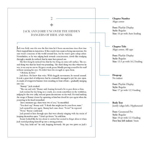
in terms of actually formatting the fic— i copy-pasted chapter by chapter from ao3 because for some reason InDesign doesn’t recognize italics automatically so i had to do that manually LOL.
what else .. uhhhh i’m pretty sure i’m forgetting something… i’ll just add on when i remember but crossing my fingers this helps!! i know InDesign isn’t what’s the most accessible to people (i have it bc of my job), but there are lots of tutorials out there on how to do it on microsoft word or even google docs!
hope your binding goes well ⭐️
#local-dragon-haunt#jackshiccup ask#otnwas#IF U NEED ANYTHING CLARIFIED LMK#im pretty bad at explaining#ndbdjsbdd#also if anyone would like to copy my format/typesetting design you can go ahead!#a credit would be nice tho maybe dkdnnddbnxbx#but please design your own book covers !!!#that’s like the most fun part tbh#go crazy go stuuuuupid
47 notes
·
View notes
Text
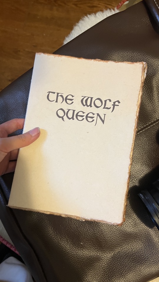
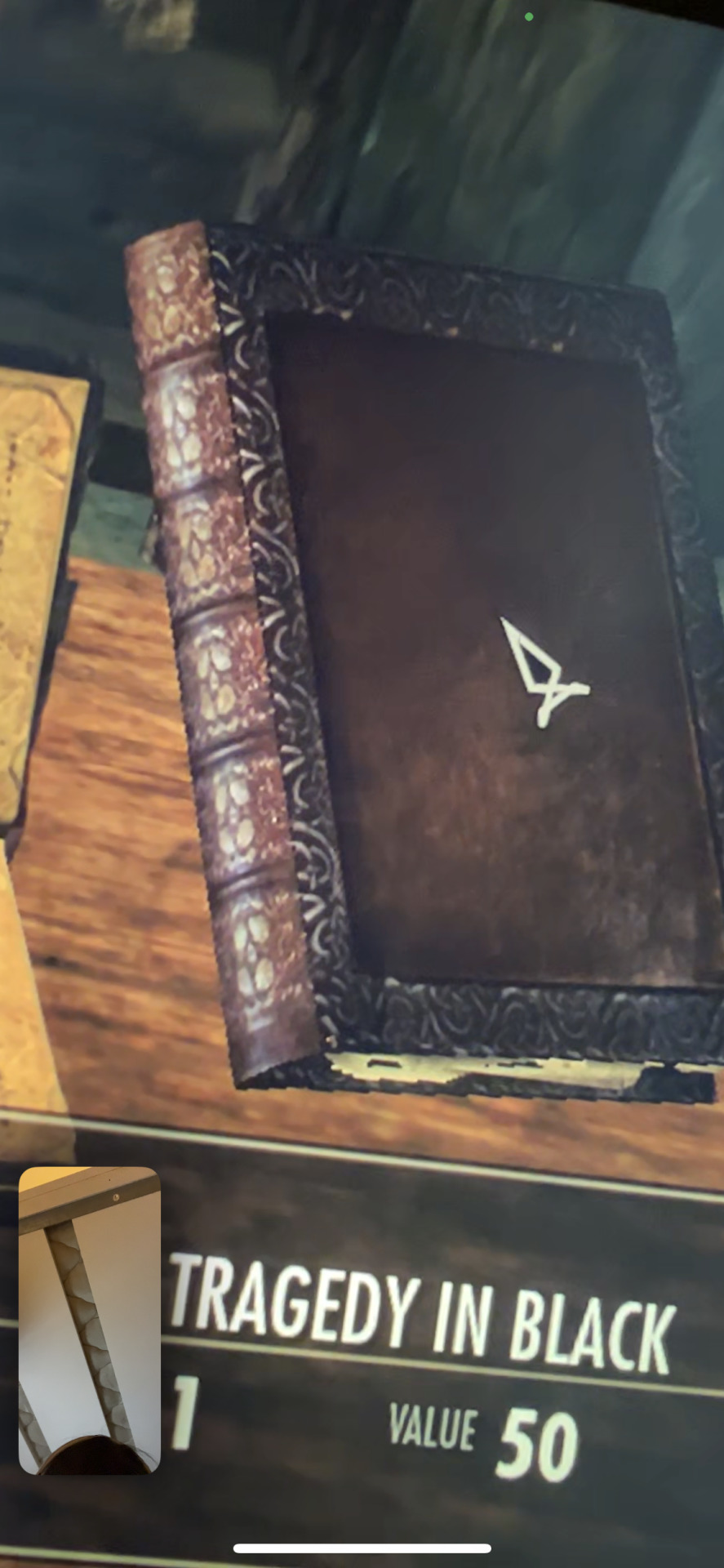
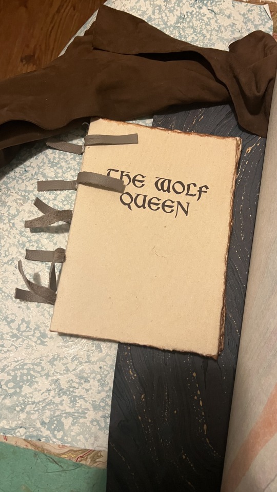
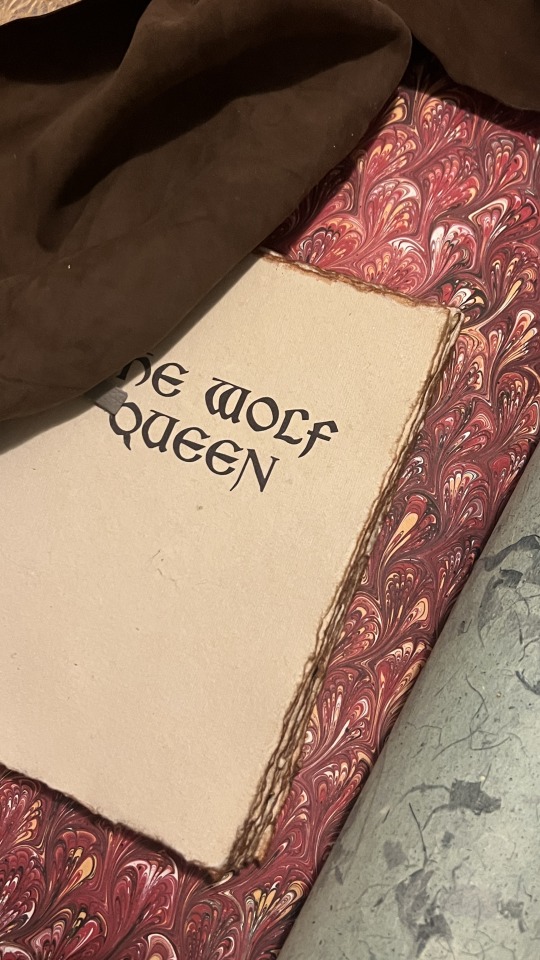
Bookbinding Process (1/2): The Wolf Queen, from The Elder Scrolls V: Skyrim
I have a very exciting comission— I’m binding The Wolf Queen, an in-game novel from The Elder Scrolls V: Skyrim. I’ve never played the game, but my client told me they enjoy collecting and reading the books in the game. According to the Elder Scrolls wiki, there are apparently 820 of them! I’m binding the one of the longer stories, which is actually broken up into 8 volumes.
In researching, it seems that the volumes seem to take on completely different binding styles, but we agreed on the style shown here. We also decided to condense these volumes into 1 book— the entire story is only about 12k words, and while the handwritten large text works well for reading the story on a small in-game window on your monitor, it’s not really practical for a physical book. That, and even if I were to print these true to size for the game, each volume would still be about 40 pages, which only equates to 10 sheets of folded paper, so it wouldn’t make for a very robust collection on the shelf.
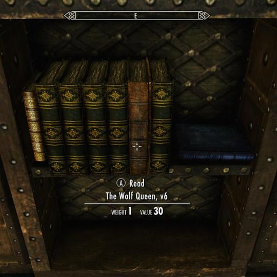

You can see that these books in this game are actually quite weathered, and it seems like all the paper is unevenly torn. If we were to equate Skyrim’s time period with our own based on technology, it’s likely these pages would have been parchment. The in-game textures definitely support this, even for the bindings that seem to be a few centuries ahead of their time.
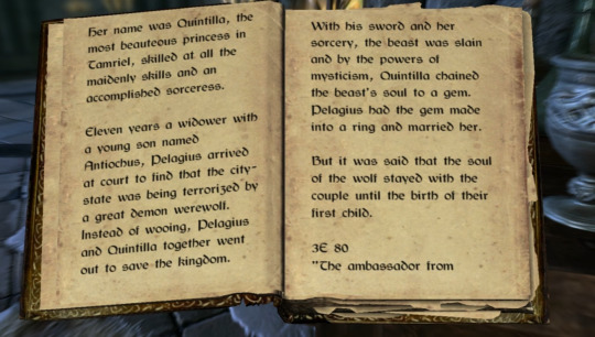
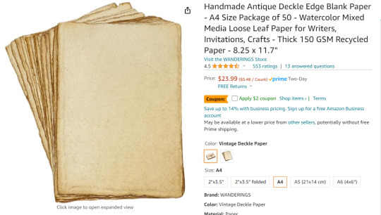
We agreed that antiqued cotton paper would be a suitable alternative, as enough parchment for this project would run a couple thousand dollars as-is, and I don’t believe I have the equipment necessary to print on it. I needed something with a quick turnaround for this project, so I went with this paper in the ‘Vintage Deckle’ finish in the A4 size. According to one review, it’s also short-grained, so it’s actually ideal for bookbinding.
Typesetting
I’m using Adobe InDesign to typeset this, but it can also be done with Word and other alternatives.
Here’s a guide by ArmoredSuperHeavy on tumblr.

I think Bethesda owns the font used in the Elder Scrolls games, but there is a dupe of it on dafont.com called Cyrodiil. However, it definitely feels and reads more as a modern font; it was designed with readability after all. I’m definitely going for something that feels like a Celtic manuscript, based both on the decorative Celtic knot tooling, and the Gaelic look of the font. I eventually found Kelmscott, which carries the same Gaelic characteristics as Cyrodiil, and is still relatively easy to read, but feels more calligraphic.


I also downloaded Medieval Victoriana for the decorative first letters of each chapter.

To typeset the text, I followed a tutorial article by Grace Fussell and Adobe’s guide for creating book files.
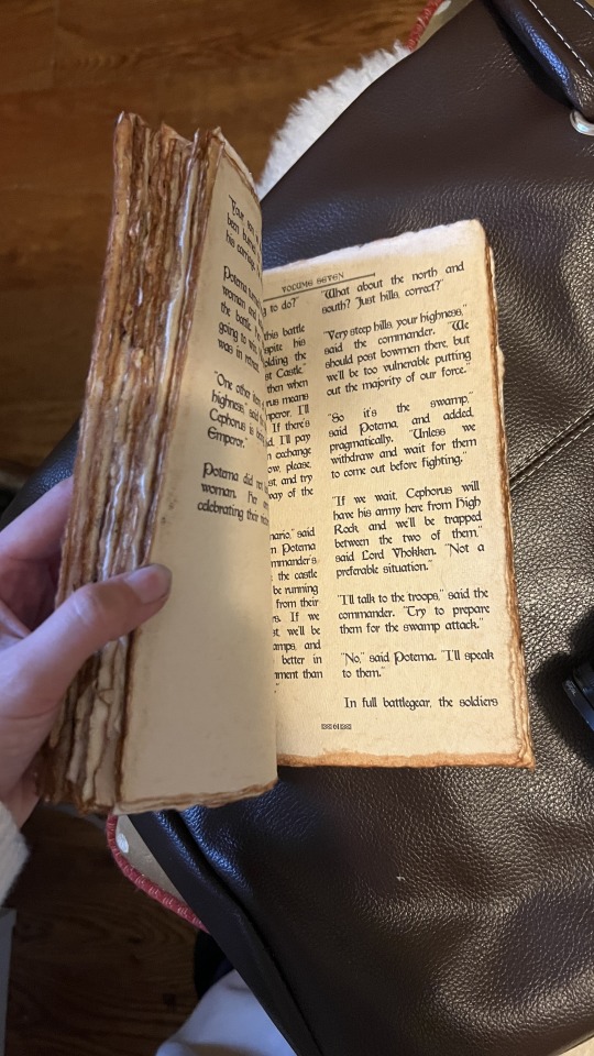
I wanted the text to look dense and almost glyphic, as many old medieval manuscripts do, while still being easy enough to read. I played around with the paragraph tools and eventually settled on this layout. While certainly not all manuscripts have multiple columns, I want this typesetting to really break the boundaries seen in most modern prints of books, so I decided on this two-column format. Some manuscripts keep the text frame smaller and in the center of the page, much like you see in later centuries when the printing area was restricted by a press, but once again, I want to emphasize the look of ‘handwritten’ manuscript, so I made sure to use wide margins.
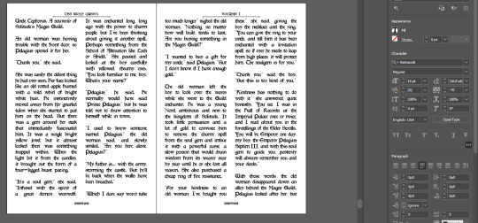
Some other fun details I added were glyphs at the beginning of each chapter, and surrounding the page numbers.
I exported the file for print with InDesign’s ‘Print Booklet’ feature, with the 2-up perfect bound with a signature size of 8 (2 pieces of paper/4 spreads/8 text pages).
Text Block
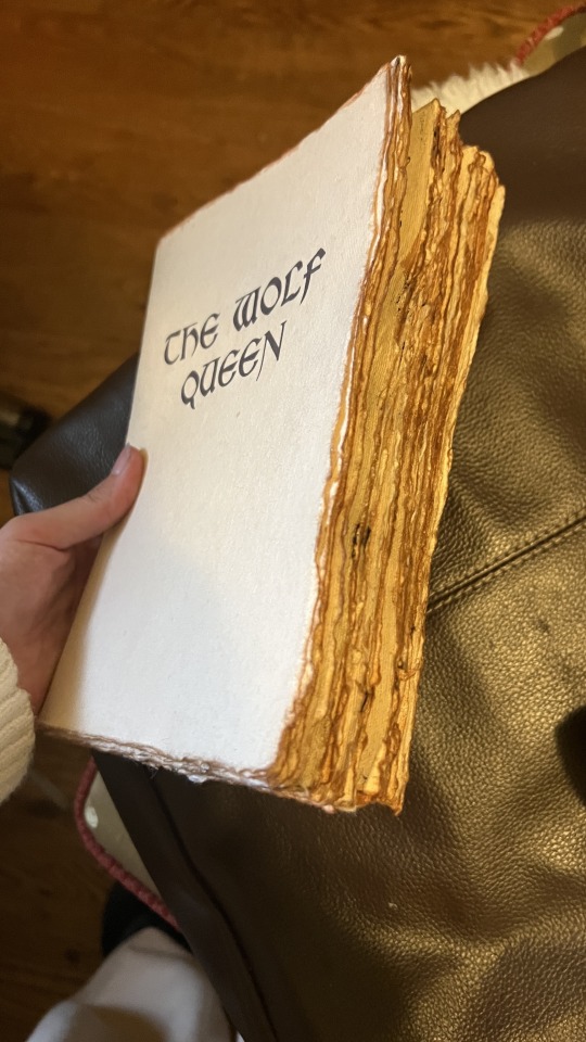
Here’s the printed and folded signatures! I’m really pleased with how these came out— it has the exact weathered look I was trying to emulate from in-game. As an added bonus, since the source material wasn’t particularly long, the thickness of the paper (150gsm) gave the text block a good amount of volume.

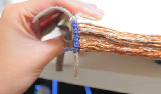
Out of lack of good online reference, my client ended up sending me photos of the book in-game. I was excited to realize this book seems to be bound on cords or leather straps— kind of difficult to tell from the model. We decided to go with a slit leather strap.

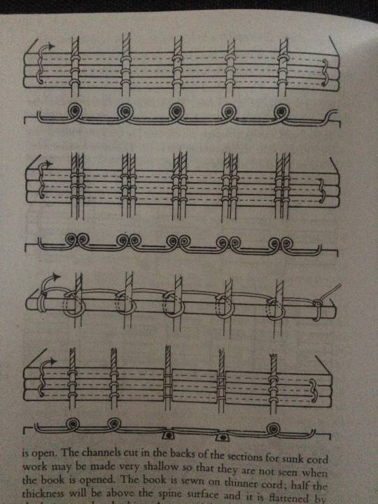
I couldn’t find a great reference image of the stitch for this, but I used the same technique of punching and sewing my signatures as this double cord instructional from The Thames and Hudson Manual of Book Binding.


Endpaper
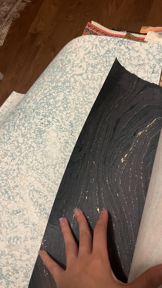
I definitely wanted to go for a more traditional endpaper, so I looked at what I had in my stash of marbled paper. I was initially drawn to this Renato Crepaldi peackock marble I got from Hollander’s, which has a beautiful red that screams “medieval” to me, but Skyrim is a cold place, so I was also drawn to go for this blizzard-esque marble. Though, I ultimately decided on this dark blue/indigo paper I got from the Paper Source.

I went for the indigo because the protagonist of this novel I’m binding, Potema Septim, the Wolf Queen herself, is associated with the color purple. Since the goal of this binding was to recreate an in-game item as it would be in-game, a bookbinder in Skyrim would also most likely want to make design choices reflecting the contents of this specific book. Or maybe they’d be illiterate and just go for the red. Either way, my client also liked the dark indigo, so that’s what we went with.
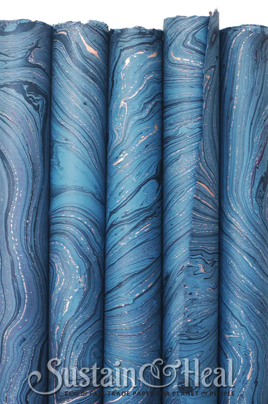
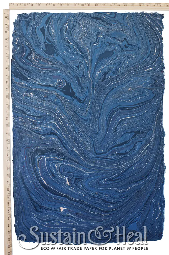
This endpaper is the cover weight of De Milo Design’s line of paper called Sustain & Heal. It’s fair trade, handmade in Bangladesh, from jute fibers.
It also has deckled edges, so I made sure to align my cuts to use that, and I tore the rest by hand to keep the natural edges consistent. This is a bit of an unconventional aesthetic choice, but it stemmed from that it’d be odd if the fly leafs were straight cut with the rest of the text block so extremely deckled.
Headbands

Keeping with the purple/indigo/blue theme, I made two-colored headbands around jute cord with DCM embroidery floss in colors 31 and 796. I basically used the technique outlined here. In retrospect though I’d recommend doing a big double endband or something bulky with this paper, since the deckled edges tend to push the endband back towards the spine and hide it.
Please continue reading here!
Process: Part 1 | Part 2 | Final Result
29 notes
·
View notes
Text
It's finally happened! I published my first game!
It is an easy to start, easy to play, pen and paper role playing game! Kinda horror adjacent, pretty silly, and well you'll see...
Peabody Goodweather's Game With A Fatal Flaw!
The illustrations held within were summoned from the primordial soup and made manifest by @supersappho
She rocks. fr fr
Fun lil fact: this was not the game I intended to publish this year. That game will likely drop next year. Hopefully alongside... more things. I made Peabody because I was engaging in my favorite past time: writing down all my ideas / doodling what comes to mind. And then I revisited him and wrote this game. Allow yourself to be charmed by your most whimsical creations.
Last note. I learned Adobe InDesign to create this layout. You can learn it. If you want to make something like this I used a great free tutorial on Youtube.
youtube
#ttrpg#Peabody Goodweathers Game With A Fatal Flaw#d6#pen and paper#adventure#indie game designer#Youtube
54 notes
·
View notes
Text
annamo bbene (parte 872)
non ho assolutamente installato InDesign, creato un nuovo file in Id, cominciato a provare a fare delle robe per ricreare un file da Figma in Id, mandato mentalmente mille mila insulti ad Adobe perché quello che vedevo sulla mia interfaccia non era quello mostrato nei tutorial online...
... per rendermi conto che era InDesign, non Illustrator.
che era quello che volevo fin dall'inizio.
no ma la sto gestendo molto bene la mia ADHD!
9 notes
·
View notes
Photo
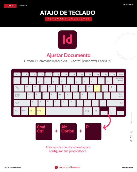
Con este atajo de teclado para Adobe Indesign podemos abrir la ventana de ajustes de documento para configurar todas las propiedades que necesitemos en el archivo o documento que estemos trabajando. En esta ventana se muestran las opciones para cambiar la calidad, cantidad de páginas, tamaño de página, márgenes y sangrado. ____ Para ver tutoriales paso a paso: ✅ https://www.youtube.com/titocampos No olvide visitar mi blog para mas tips, lecturas y recursos gratuitos ➡️ https://blog.titocampos.com Más contenido en los enlaces de la biografía ➡️ https://links.titocampos.com _____
#indesign#adobe#atajos#trucos#tips#shortcuts#aeshortcuts#importar#import#importFiles#importarArchivos#tricks#tipsAndTricks#AeTips#tutorial#aprendizaje#creativecloud#creative#adobeCC
0 notes
Text
adobe products I know how to use from easiest to hardest to learn. really interesting stuff I know
acrobat pro - easy, intuitive, helpful. -1 point for being very hard to download illegally.. something about the software makes it only stay cracked for a few days so I download/crack it once a year when I really need to edit a pdf
lightroom - haven't used for anything very complicated but used it to compile high def photos of flies from a microscope for a whole summer. straightforward
dreamweaver - had to use it for website design in college once.. totally useless application, but not too difficult. could figure it out in a few hrs
audition - ive used this to edit podcasts for a school project... not too bad, but have never used it for actual music purposes, so hard to judge
indesign - I love you adobe indesign, so good for poster design, definitely easier to use if you come in with prev. experience from other adobe applications. kind of a learning curve if you haven't though. started using it middle school for a journalism class and now use it for making figures and posters— blends super well with illustrator
premiere pro - starting to get into the ones that have driven me to tears. I came into it with 0 experience from any other video editing software. I still don’t understand how to truly use keyframes. that said I have successfully edited and captioned videos multiple times with it, useful app
photoshop - by far the most experience with photoshop. I love you adobe photoshop but definitely takes practice. spent weeks watching tutorials when I was 11 just so I could make some horse edits and use it to this day all the time
illustrator - what’s a vector, really, and why does the pen tool never work like I think it should. what do you mean that didn’t form a path. extremely powerful software that is truly top of the line for figure making but requires more study than I ever have time to give it since i’m always using it super rushed
after effects - homer simpson am I disabled meme. like all the difficulties of photoshop combined with all the difficulties of premiere pro and then you also have to check every frame. total nightmare that I spent a solid week trying to learn one summer
8 notes
·
View notes
Text
Whatever project you're too afraid to start, just go for it
I know a lot of my posts lately have been video/content creation-related but I just want to say:
The learning curve that I have had to climb in the past week alone has been both frustrating as hell and ridiculously rewarding.
Already, I had to refresh my memory on basic video editing and sound comping, but for the first seven episodes of my little series I’d accepted the average quality of my voice recording as cest la vie, I’m not sinking money into this without proof of concept, you’re supposed to be a little rough around the edges when you’re first starting out. But one thing I couldn’t get over was the clipping from some technobabble shenanigans with frequencies that isn’t important here.
What I thought was a quick fix—replace and double the RAM in my laptop—was absolutely not the source of the problem and suddenly I was in the deep end trying to fix broken audio in post while also troubleshooting an issue no one else seemed to have between my microphone and my recording software and I was about tempted to just use my desktop mic, the built-in, because at least I could somewhat fix that in post.
After far too many hours deep in discussions with strangers on the internet who were very helpful, I half-fixed the problem. My mic stopped clipping, but it was distorting pretty heavily between two different processers and my recording software hated it for a whole different reason.
Reluctant Plan B was to record gameplay live, but record audio separately/after and then sync them in post. If you’ve ever made a gaming video like these, you’re staring at probably 15+ clips of useable content over the course of recording sessions, which means 30+ clips with all the separately recorded audio, and since I can’t hit start/stop congruently with both programs, they would always be a little bit off, which meant more tedious editing.
Why? Because I was recording in Program A, fixing audio in Program B, and editing the video together in Program C, and Program C is for like, tiktoks, not professional youtube videos. I was only using it because I was already paying for it in an Adobe package with InDesign.
Enter DaVinci Resolve.
It’s like, Photoshop compared to MS Paint, a free one-stop-shop for video and audio editing (and visual effects, this thing is used to make blockbusters) and here’s me still confused by all these audio terms like ratio, attack, threshold, etc.
So I’m still wading through tutorials, all while my mic only works through Program B, Audacity, with an episode deadline looming over me. From the time I committed to initially fixing my audio by replacing the RAM, to episode release date, I had 6 days. Today is day 4.
And I’m still without a proper recording setup because Program A hates my microphone. But I am not missing this deadline, not just for the youtube algorithm, but because I know I can make it.
So episode 8, at the time of writing this, I have only 9 minutes and 25 seconds all edited and ready to go, out of 22-24 that I usually publish. So what have I done?
Fuckin’ taught myself DaVinci Resolve and committed to recording my vocal track in post just this once, doing it over and over again until it sounds as genuinely live as it can, and doing regular voiceover and music montages wherever else I can to fill the time with meaningful content.
All to buy myself time for my replacement mic to deliver so I can get back to proper live recordings, because at this point, the time it takes to fix terrible audio in post isn’t worth it, when I can spend a little bit of money for a mic that isn’t 8 years old and is built for gaming, not podcasting (but I am keeping the problem child as a backup, because it’s not broken).
I’m waiting for a timelapse to render while I write this, staring at a workflow with one video source and 3 different audio layers—game sound, vocals, and music—and I can almost turn my brain off when trimming things because that part I already know how to do.
This thing is a mess, to be clear, but it sure as hell won’t look like a mess when I hit publish on time two days from now.
But like…. 3 weeks ago I knew next to none of this, beyond basic video editing I learned back in college. And here I am with my double-wide monitor up and professional video making software quietly churning along in the background.
So just—if you want to do it? Go fuckin’ do it. Whatever it is that you’ve been holding off on pursuing. When I started I already owned things like a gaming laptop (that I bought to run photoshop so I could paint), an 8-year-old podcasting mic from a dropped podcast attempt, my game of choice, and I was already paying for the bare bones version of Premiere: Premiere Rush.
But heck, even if I had none of the fancy equipment, the only limiting factor would have been my computer’s processing power to run all these programs at once, and I would have figured it out.
I’m a perfectionist bound and determined to fix my audio, but I didn’t hear any complaints when it was jank, and I’m learning all this because the whole process, not just the gameplay, is just so fun and fascinating.
#just do it#do it scared#video making#video editing#davinci resolve#it's a beautiful mess#and I'm so proud of it
32 notes
·
View notes
Note
Ooh, how'd you get into bookbinding? It looks really cool but I'm also intimidated.
Hi anon!
So I found bookbinding by seeing some of the binds @renegadeguild had posted and decided to do some investigating. I had seen people selling binds on Etsy (WHICH IS SUPER FUCKING ILLEGAL) and had always thought about bookbinding my own - I had watched bookbinding youtube vids via DAS Bookbinding for quite some time at this point but finding renegade helped me get into a community.
So I had a fic that I always liked to come back to read, a bunch of printer paper, some fabric, elmer's glue, and some museum board I had used for some dioramas I made. Along with some thread and a push pin.... that's how I made my first book! With materials I already have! You don't need to buy the perfect paper or proper book cloth or etc etc. You can make a book with just some things you have laying about the house. Even gluing together layers of cereal box to make book board is totally fine! I mean hell, I used some of the fake $2 craft leather from dollar tree for this last bind I just did (and honestly it worked out really well)
I already had Adobe InDesign, but plenty of people use Microsoft word. I also recommend Affinity Designer. One time fee for professional grade layout software that won't make you cry like Word does.
I have been thinking about putting together a tutorial of how I bind a book (am I avoiding writing? possible) so if this is something people are interested in? My next bind is laying out @vampire-exgirlfriend's fic, They Say I Killed You (Haunt Me Then) once she's completed that and has made any adjustments/minor edits to her story!
13 notes
·
View notes
Text

The Five Important Tips for Beginner Graphic Designers 𝟏. 𝐋𝐞𝐚𝐫𝐧 𝐭𝐡𝐞 𝐁𝐚𝐬𝐢𝐜𝐬 𝐨𝐟 𝐃𝐞𝐬𝐢𝐠𝐧 𝐏𝐫𝐢𝐧𝐜𝐢𝐩𝐥𝐞𝐬 -> Study foundational principles like balance, contrast, alignment, hierarchy, and repetition. These form the backbone of good design. -> Explore color theory and typography to understand how they influence visual communication. 𝟐. 𝐌𝐚𝐬𝐭𝐞𝐫 𝐃𝐞𝐬𝐢𝐠𝐧 𝐒𝐨𝐟𝐭𝐰𝐚𝐫𝐞 -> Familiarize yourself with industry-standard tools such as Adobe Photoshop, Illustrator, and InDesign, or alternatives like Canva, Figma, and Affinity Designer. -> Start with tutorials and practice creating simple projects to build confidence. 𝟑. 𝐁𝐮𝐢𝐥𝐝 𝐚 𝐏𝐨𝐫𝐭𝐟𝐨𝐥𝐢𝐨 𝐄𝐚𝐫𝐥𝐲 -> Start compiling your work, even small projects, to showcase your skills. This could include personal projects, class assignments, or mock designs. -> Focus on quality over quantity, and tailor your portfolio to reflect the design work you want to pursue. 𝟒. 𝐒𝐞𝐞𝐤 𝐅𝐞𝐞𝐝𝐛𝐚𝐜𝐤 𝐚𝐧𝐝 𝐈𝐭𝐞𝐫𝐚𝐭𝐞 -> Share your work with peers, mentors, or online communities for constructive feedback. Platforms like Behance and Dribbble are great for this. -> Be open to criticism, which will help you grow and refine your skills. 𝟓. 𝐒𝐭𝐚𝐲 𝐂𝐮𝐫𝐢𝐨𝐮𝐬 𝐚𝐧𝐝 𝐊𝐞𝐞𝐩 𝐋𝐞𝐚𝐫𝐧𝐢𝐧𝐠 -> Follow design trends and inspiration on platforms like Pinterest, Instagram, or design blogs. -> Take online courses, attend workshops, or read books to keep up with evolving techniques and industry standards.
Hire me fiverr.com/s/GzK9ja7
GraphicDesign #graphicdesigner #OliurRh #designinspiration #creativedesign #designlife #LearnDesign #designtips #beginnerdesigner #graphicdesigntips #graphicdesigncommunity #DesignSkills #designthinking #creativeprocess #ArtAndDesign #CreativeJourney #designdaily #photoshoptips #illustratortips #LearnPhotoshop #designtools #GraphicDesignLovers #designmotivation #digitalart
#graphic design#graphicdesigner#responsivedesign#designinspiration#artists on tumblr#donald trump#brandidentity#userexperience#ryan gosling#michael cera#margot robbie#barbie#easter
2 notes
·
View notes